 Dotta
f257530537
Dotta
f257530537
## Thinking Path > - Paperclip operators spend most of their time scanning the board, inbox, sidebar, and local dev status surfaces > - Small UI and dev-ops frictions make repeated operator workflows feel slower than they need to be > - The working branch contained several independent quality-of-life improvements mixed with larger cloud work > - Grouping these smaller UI/dev-ops changes together keeps review overhead reasonable without merging them into feature PRs > - This pull request collects the operator-facing QoL polish into one standalone branch > - The benefit is a cleaner board navigation and local dev recovery experience without depending on cloud upstream sync ## What Changed - Relaxed forced 44px touch targets for small inline widgets. - Fixed mobile mention menu scrolling and sidebar spacing on touch/mobile layouts. - Synced inbox hover state with j/k selection. - Moved plugin sidebar entries into the Work section. - Added manual dev-server restart action/banner behavior. - Logged plugin bridge 502 causes for better diagnosis. ## Verification - `pnpm install --frozen-lockfile --ignore-scripts` - `pnpm --filter @paperclipai/plugin-sdk build` - `pnpm exec vitest run ui/src/components/MarkdownEditor.test.tsx ui/src/components/Sidebar.test.tsx ui/src/components/SidebarProjects.test.tsx ui/src/pages/Inbox.test.tsx ui/src/components/DevRestartBanner.test.tsx server/src/__tests__/dev-server-status.test.ts server/src/__tests__/health-dev-server-token.test.ts server/src/__tests__/plugin-routes-authz.test.ts` initially failed only because plugin SDK `dist` was not built in the fresh worktree. - Rerun after build: `pnpm exec vitest run server/src/__tests__/plugin-routes-authz.test.ts` passed. - The remaining targeted UI/dev-server tests passed on the first post-install run. ## Visual Evidence - Sidebar layout and plugin Work section: 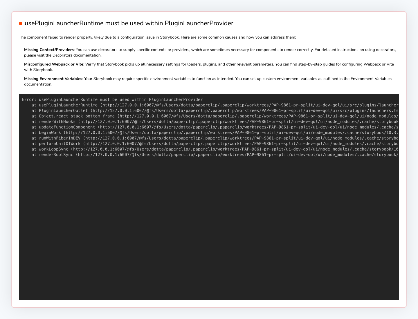 - Inbox/task row selection and hover-state surface:  - Dev restart banner desktop: 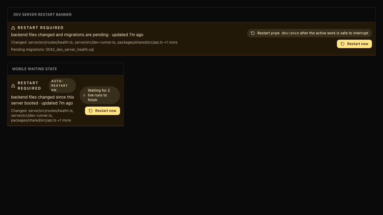 - Dev restart banner mobile: 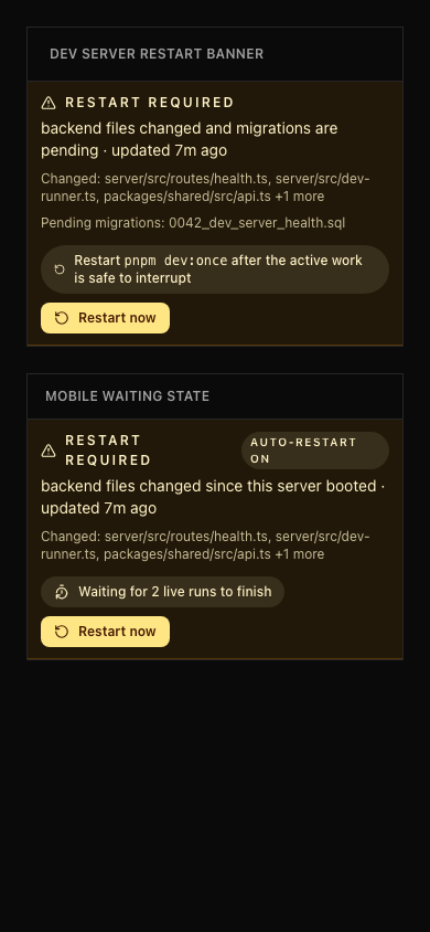 ## Risks - Mostly UI/dev ergonomics with low data risk. - Sidebar and inbox changes touch frequently used navigation surfaces, so visual review on desktop/mobile is still useful. > For core feature work, check [`ROADMAP.md`](ROADMAP.md) first and discuss it in `#dev` before opening the PR. Feature PRs that overlap with planned core work may need to be redirected — check the roadmap first. See `CONTRIBUTING.md`. ## Model Used - OpenAI Codex, GPT-5-based coding agent with local shell/git/tool use. Exact hosted model ID and context-window size are not exposed by the local Paperclip adapter runtime. ## Checklist - [x] I have included a thinking path that traces from project context to this change - [x] I have specified the model used (with version and capability details) - [x] I have checked ROADMAP.md and confirmed this PR does not duplicate planned core work - [x] I have run tests locally and they pass - [x] I have added or updated tests where applicable - [x] If this change affects the UI, I have included before/after screenshots - [x] I have updated relevant documentation to reflect my changes - [x] I have considered and documented any risks above - [x] I will address all Greptile and reviewer comments before requesting merge --------- Co-authored-by: Paperclip <noreply@paperclip.ing>
215 lines
6.7 KiB
TypeScript
215 lines
6.7 KiB
TypeScript
import { useState, type ComponentType, type ReactNode } from "react";
|
|
import { Link } from "@/lib/router";
|
|
import { ChevronRight } from "lucide-react";
|
|
import { Button } from "@/components/ui/button";
|
|
import { useSidebar } from "../context/SidebarContext";
|
|
import {
|
|
Collapsible,
|
|
CollapsibleContent,
|
|
CollapsibleTrigger,
|
|
} from "@/components/ui/collapsible";
|
|
import {
|
|
DropdownMenu,
|
|
DropdownMenuContent,
|
|
DropdownMenuItem,
|
|
DropdownMenuRadioGroup,
|
|
DropdownMenuRadioItem,
|
|
DropdownMenuSeparator,
|
|
DropdownMenuTrigger,
|
|
} from "@/components/ui/dropdown-menu";
|
|
import { cn } from "@/lib/utils";
|
|
|
|
type SidebarSectionIcon = ComponentType<{ className?: string }>;
|
|
|
|
export type SidebarSectionMenuAction =
|
|
| {
|
|
type: "item";
|
|
label: string;
|
|
icon?: SidebarSectionIcon;
|
|
href?: string;
|
|
onSelect?: () => void;
|
|
}
|
|
| { type: "separator" };
|
|
|
|
export type SidebarSectionRadioChoice = {
|
|
label: string;
|
|
value: string;
|
|
};
|
|
|
|
type SidebarSectionMenu = {
|
|
actions?: SidebarSectionMenuAction[];
|
|
ariaLabel?: string;
|
|
radioChoices?: SidebarSectionRadioChoice[];
|
|
radioLabel?: string;
|
|
radioValue?: string;
|
|
onRadioValueChange?: (value: string) => void;
|
|
};
|
|
|
|
type SidebarSectionHeaderAction = {
|
|
ariaLabel: string;
|
|
icon: SidebarSectionIcon;
|
|
onClick: () => void;
|
|
};
|
|
|
|
interface SidebarSectionProps {
|
|
label: string;
|
|
children: ReactNode;
|
|
collapsible?: {
|
|
open: boolean;
|
|
onOpenChange: (open: boolean) => void;
|
|
};
|
|
menu?: SidebarSectionMenu;
|
|
headerAction?: SidebarSectionHeaderAction;
|
|
}
|
|
|
|
function SidebarSectionHeader({
|
|
collapsible,
|
|
headerAction,
|
|
label,
|
|
menu,
|
|
}: Pick<SidebarSectionProps, "collapsible" | "headerAction" | "label" | "menu">) {
|
|
const { isMobile } = useSidebar();
|
|
const [menuOpen, setMenuOpen] = useState(false);
|
|
const hasMenu = Boolean(
|
|
menu && ((menu.actions?.length ?? 0) > 0 || (menu.radioChoices?.length ?? 0) > 0),
|
|
);
|
|
const labelClassName = "text-[10px] font-medium uppercase tracking-widest font-mono text-muted-foreground/60";
|
|
const headerControlVisibilityClassName = isMobile
|
|
? "opacity-100"
|
|
: "opacity-0 group-hover/sidebar-section:opacity-100 group-focus-within/sidebar-section:opacity-100";
|
|
const caretClassName = cn(
|
|
"h-3 w-3 shrink-0 text-muted-foreground/60 transition-all",
|
|
headerControlVisibilityClassName,
|
|
collapsible?.open && "rotate-90",
|
|
menuOpen && "opacity-100",
|
|
);
|
|
const actionClassName = cn(
|
|
"h-5 w-5 shrink-0 text-muted-foreground/60 transition-opacity hover:text-foreground data-[state=open]:opacity-100",
|
|
headerControlVisibilityClassName,
|
|
);
|
|
const headerContent = <span className={labelClassName}>{label}</span>;
|
|
const HeaderActionIcon = headerAction?.icon;
|
|
|
|
const headingControl = hasMenu ? (
|
|
<DropdownMenu open={menuOpen} onOpenChange={setMenuOpen}>
|
|
<DropdownMenuTrigger asChild>
|
|
<button
|
|
type="button"
|
|
data-slot="icon-button"
|
|
className={cn(
|
|
"inline-flex min-w-0 max-w-full items-center rounded-md px-1 py-0.5 text-left outline-none transition-colors",
|
|
"hover:bg-accent/50 focus-visible:bg-accent/50 focus-visible:ring-2 focus-visible:ring-ring focus-visible:ring-offset-1",
|
|
menuOpen && "bg-accent/50",
|
|
)}
|
|
aria-label={menu?.ariaLabel ?? `${label} actions`}
|
|
>
|
|
{headerContent}
|
|
</button>
|
|
</DropdownMenuTrigger>
|
|
<DropdownMenuContent align="start" className="w-48">
|
|
{menu?.actions?.map((action, index) => {
|
|
if (action.type === "separator") {
|
|
return <DropdownMenuSeparator key={`separator-${index}`} />;
|
|
}
|
|
const Icon = action.icon;
|
|
const content = (
|
|
<>
|
|
{Icon ? <Icon className="size-4" /> : null}
|
|
<span>{action.label}</span>
|
|
</>
|
|
);
|
|
if (action.href) {
|
|
return (
|
|
<DropdownMenuItem key={`${action.label}-${index}`} asChild>
|
|
<Link to={action.href}>{content}</Link>
|
|
</DropdownMenuItem>
|
|
);
|
|
}
|
|
return (
|
|
<DropdownMenuItem key={`${action.label}-${index}`} onSelect={action.onSelect}>
|
|
{content}
|
|
</DropdownMenuItem>
|
|
);
|
|
})}
|
|
{menu?.radioChoices && menu.radioChoices.length > 0 ? (
|
|
<DropdownMenuRadioGroup
|
|
value={menu.radioValue}
|
|
onValueChange={menu.onRadioValueChange}
|
|
aria-label={menu.radioLabel}
|
|
>
|
|
{menu.radioChoices.map((choice) => (
|
|
<DropdownMenuRadioItem key={choice.value} value={choice.value}>
|
|
{choice.label}
|
|
</DropdownMenuRadioItem>
|
|
))}
|
|
</DropdownMenuRadioGroup>
|
|
) : null}
|
|
</DropdownMenuContent>
|
|
</DropdownMenu>
|
|
) : (
|
|
<div className="inline-flex min-w-0 max-w-full items-center px-1 py-0.5">{headerContent}</div>
|
|
);
|
|
|
|
return (
|
|
<div className="group/sidebar-section px-3 py-1.5 pointer-coarse:py-1">
|
|
<div className="relative flex min-h-6 min-w-0 items-center gap-1">
|
|
{collapsible ? (
|
|
<CollapsibleTrigger asChild>
|
|
<button
|
|
type="button"
|
|
data-slot="icon-button"
|
|
className="absolute -left-4 flex h-5 w-5 items-center justify-center rounded-sm outline-none transition-colors hover:bg-accent focus-visible:ring-2 focus-visible:ring-ring focus-visible:ring-offset-1"
|
|
aria-label={collapsible.open ? `Collapse ${label}` : `Expand ${label}`}
|
|
>
|
|
<ChevronRight className={caretClassName} aria-hidden="true" />
|
|
</button>
|
|
</CollapsibleTrigger>
|
|
) : null}
|
|
{headingControl}
|
|
{headerAction && HeaderActionIcon ? (
|
|
<Button
|
|
variant="ghost"
|
|
size="icon-xs"
|
|
className={actionClassName}
|
|
aria-label={headerAction.ariaLabel}
|
|
onClick={headerAction.onClick}
|
|
>
|
|
<HeaderActionIcon className="h-3.5 w-3.5" />
|
|
</Button>
|
|
) : null}
|
|
</div>
|
|
</div>
|
|
);
|
|
}
|
|
|
|
export function SidebarSection({
|
|
label,
|
|
children,
|
|
collapsible,
|
|
menu,
|
|
headerAction,
|
|
}: SidebarSectionProps) {
|
|
const content = <div className="flex flex-col gap-0.5 mt-0.5">{children}</div>;
|
|
|
|
if (collapsible) {
|
|
return (
|
|
<Collapsible open={collapsible.open} onOpenChange={collapsible.onOpenChange}>
|
|
<SidebarSectionHeader
|
|
label={label}
|
|
collapsible={collapsible}
|
|
menu={menu}
|
|
headerAction={headerAction}
|
|
/>
|
|
<CollapsibleContent>{content}</CollapsibleContent>
|
|
</Collapsible>
|
|
);
|
|
}
|
|
|
|
return (
|
|
<div>
|
|
<SidebarSectionHeader label={label} menu={menu} headerAction={headerAction} />
|
|
{content}
|
|
</div>
|
|
);
|
|
}
|